In May this year, I had the opportunity to meet HMD Global EVP and CMO Pekka Rantala after the launch of the Nokia 7 Plus in Delhi. During our conversation, the Finn told me that Nokia does not blindly follow smartphone trends, but goes with what its customers and fans want. This was regarding the display notch, a trend that had picked up thanks to Essential and Apple.
Back then, the Nokia 7 Plus was a shining example of the HMD Global’s philosophy and it turned out to be a really great smartphone in the mid-range segment as soon as it was launched.
The Nokia 7 Plus, was built like a tank, looked unique with its matte black/copper finish (also came in White/Copper) and also packed in a Qualcomm Snapdragon 660 SoC.
It did not feature a notch, but just a taller 18:9 display. Its customers really did not care, because it looked gorgeous and unique, which is a rarity in the sea of similar, mid-range smartphones that flooded the market back around May this year. This would also include the low-cost flagship, which was launched a few months later in August, called the Poco F1, which was out to slay every smartphone in the mid-range. Long story short, it did not and it still hasn’t.
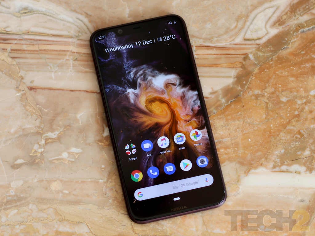
The Nokia 8.1. Image: tech2/Omkar Patne
Just a few weeks ago, Nokia announced what everyone thought was the successor to the Nokia 7 Plus, called the Nokia 7.1 and also launched a Nokia 8.1, which everyone assumed would be the successor to the Nokia 8, going by their model names.
Going by Nokia's customer-centric product ideas, it now appears that Nokia's customers want a better display (with HDR 10 support) in a smaller phone (hence the notch) and they are also looking for all of that in a stylish body.
After using the smartphone for more than a week, the Nokia 8.1 indeed turned out to be a worthy replacement for the Nokia 7 Plus as I had expected it to be. It’s not perfect, but its polished and premium looks are enough to attract the spec-hungry OnePlus crowd given the capable hardware that it packs in.
More importantly, it’s a true mid-range device that makes an impression, comes with the right balance of hardware and software and easily takes down the Rs 19,999 Poco F1 with the power of its Zeiss optics and a pure Android 9 Pie experience.
Nokia 8.1 Build and Design: 8/10
The Nokia 7 Plus had its set of fans and the 8.1 will also see a following with that gorgeous design that goes big on details.
Nokia continues to use the dual-tone anodised metal frame that blew us away on the 7 Plus.
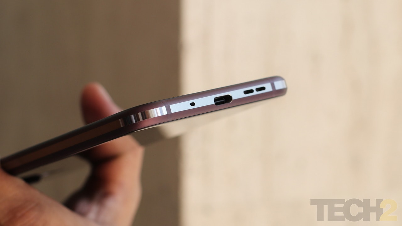
The Nokia 8.1. Image: tech2/Omkar Patne
It is now a lot more subtle, but also looks classy thanks to the 2.5D glass back that is rounded at the edges, similar to the screen on the front.
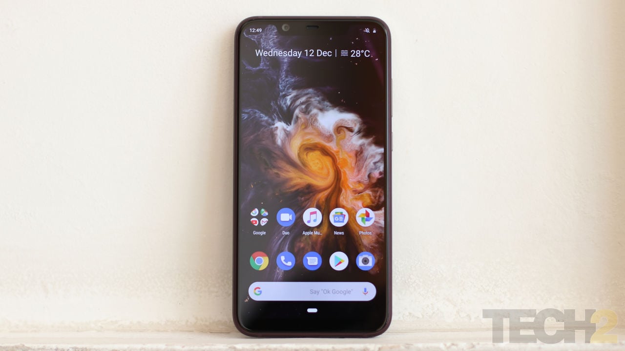
The Nokia 8.1. Image: tech2/Omkar Patne
The metal frame is now rounded, both around the corners and around the edges. This combined with the glass screens makes the 8.1 a really slippery smartphone.
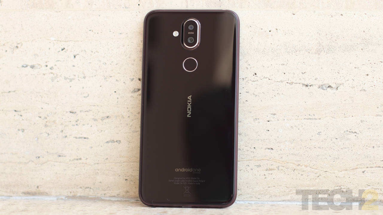
The Nokia 8.1. Image: tech2/Omkar Patne
Still, don’t buy a case because you will want to show off this phone, especially if you have purchased the ‘Iron’ colour, which is a brand new shade from Nokia (just for this smartphone). The Blue/Silver looks a bit dull in my opinion. The shiny, exposed aluminium finish gives a unique look to the smartphone and rounded edges also give it a slimmer overall profile even though the phone is as thick as its predecessor.
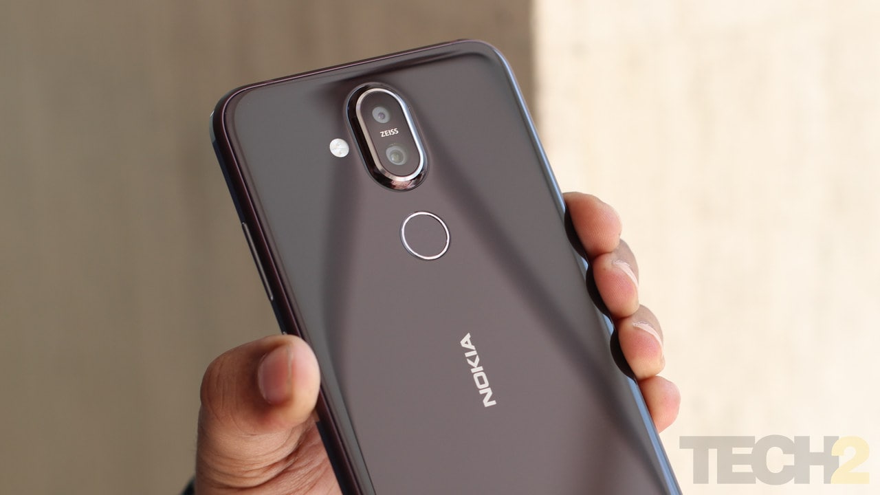
The Nokia 8.1. Image: tech2/Omkar Patne
I also love how well polished and finished every single cavity and gap on this frame is. It’s indeed in a class of its own despite having a massive display notch.
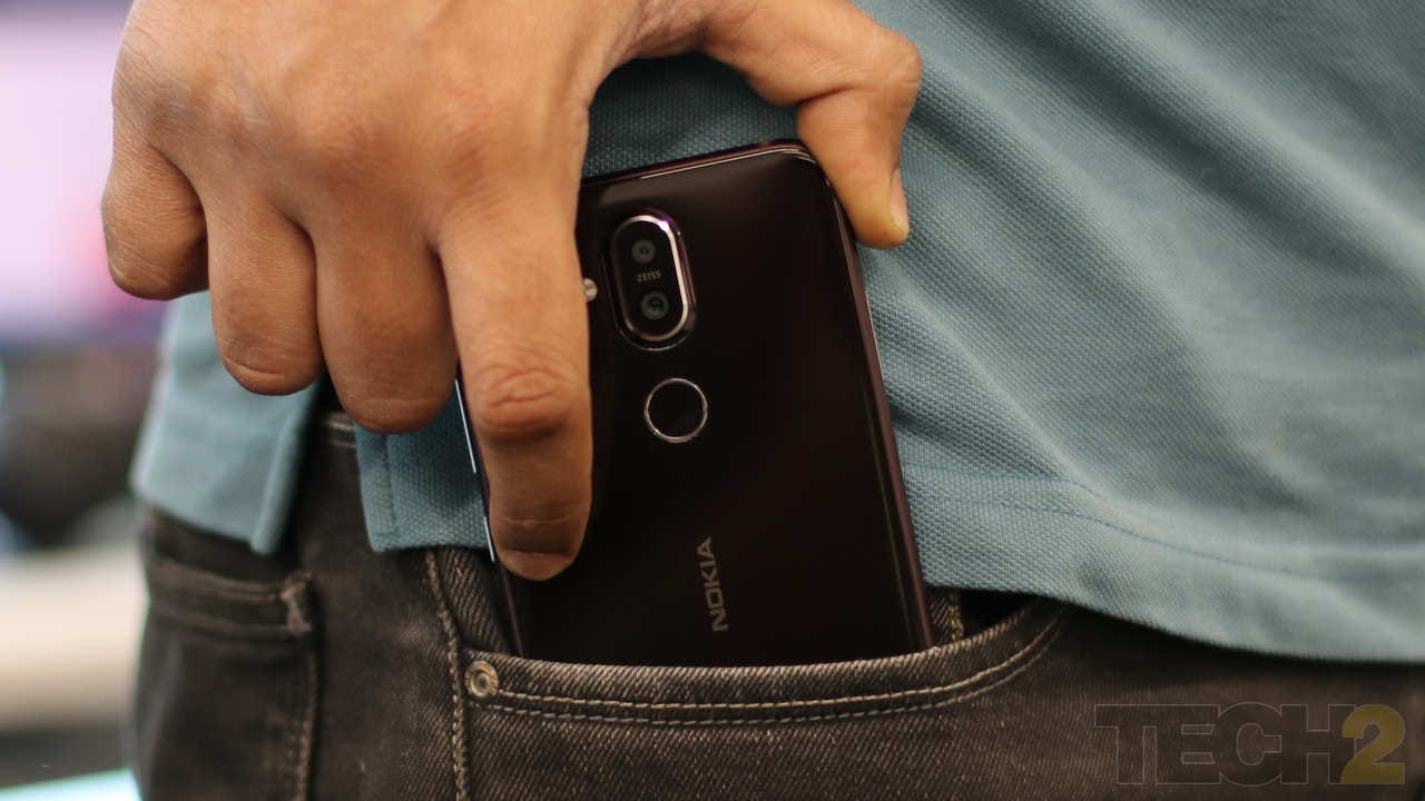
The Nokia 8.1. Image: tech2/Omkar Patne
I really don’t know what is in there. The large notch seems to have just the essentials with the usual array of sensors, a single camera and the receiver, which strangely does not double up as a second speaker. Indeed, this is a missed opportunity as the notch on the 7.1 is literally half its size and basically does the same job.
Nokia 8.1 Display: 8/10
The 8.1’s display definitely beats the one on the lower-priced Poco F1. In the bright afternoon sunlight, Nokia’s PureDisplay keeps the colours intact and legible, there’s no need to squint as you do with most other smartphones in this segment because its brightness levels are more than adequate to tackle this kind of lighting.
The notched 6.18-inch display features an FHD+ resolution and is covered in Gorilla Glass. It also features HDR 10 support which is supposed to deliver richer colours and better contrast.
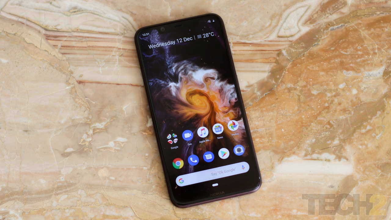
The Nokia 8.1. Image: tech2/Omkar Patne
While the colours did look a tad bit saturated, it could not deliver contrasted HDR scenes no matter which HDR video I picked to watch on YouTube. Indeed it's not about accepting HDR footage, but what you do with it that counts. And in this case, it just cannot deliver (yet). Netflix does not officially support the device either, so at the moment the HDR branding is only a gimmick.
But that does not mean that this is a bad display. At its price tag, the 8.1 offers one of the best displays in its class.
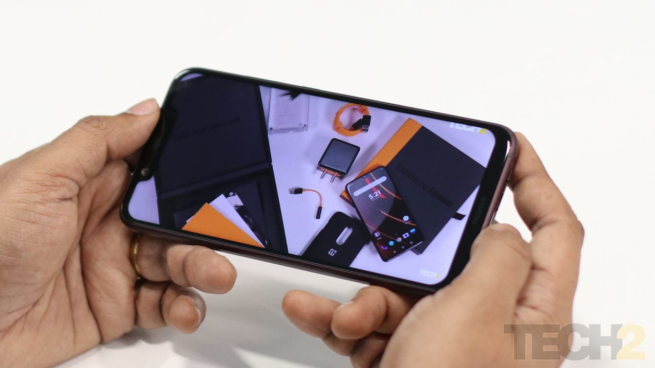
The Nokia 8.1. Image: tech2/Omkar Patne
For once, you can head into Settings>Display>PureDisplay and actually choose between the phone’s default Dynamic mode colour profile (that adjusts colour, contrast and brightness as per usage) or Vivid (higher saturation) or Cinema (which adds a yellow hue making it easier and more comfortable on the eyes when viewing video). If you prefer natural-looking colours, then you can select the Basic colour profile.
Nokia 8.1 Features: 8/10
The Nokia 8.1 indeed, packs in everything I could ask from a smartphone in this segment and at this price tag of Rs 26,999. I wished that it featured a dual speaker setup and may be an IP 67 rating, as everything else is pretty much taken care of.
The Nokia 8.1 features a 6.18-inch FHD+ LCD display and is protected by Corning's Gorilla Glass. Inside, there is a shiny-new 10 nm Qualcomm Snapdragon 710 SoC that is paired with 4 GB RAM and 64 GB of storage (expandable up to 400 GB using the hybrid SIM tray). While Oppo offers 6 GB RAM with its R17 Pro, the Nokia 8.1 should not need much considering that it runs stock Android 9 Pie (Android One) with all of its performance optimisations.
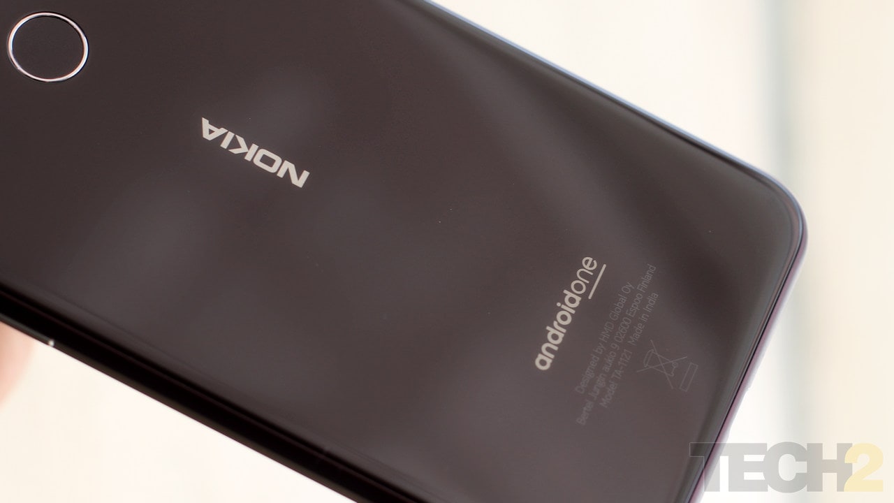
The Nokia 8.1. Image: tech2/Omkar Patne
There’s a dual camera set up at the rear with a 12 MP AF + 13 MP cameras to produce bokeh images. The front-facing camera is a 20 MP unit with an AI-assisted Live Bokeh mode.
Connectivity options include a dual SIM setup with dual standby supporting 4G VoLTE bands, Wi-Fi 802.11 b/g/n/ac, Bluetooth 5.0 and GPS/AGPS+GLONASS+Beidou. At the bottom edge, sits a USB Type-C port (2.0) and 3.5 mm headphone jack is located at the top edge. The device also features an FM Radio.
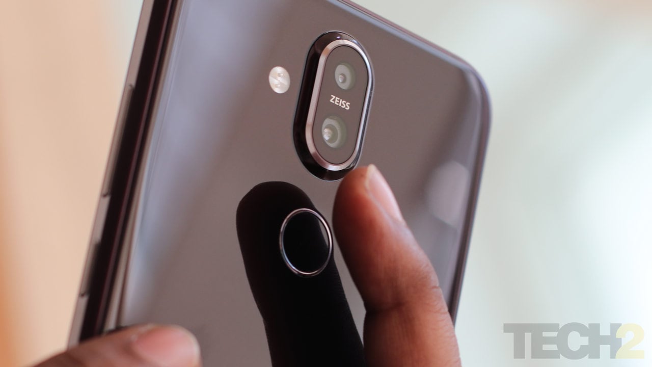
The Nokia 8.1. Image: tech2/Omkar Patne
The fingerprint reader sits at the back and below it is a 3,500 mAh battery that supports 18 W fast-charging.
Nokia 8.1 OS and Software: 8/10
Running stock Android, the user experience was pleasant without going overboard with bloatware like most smartphones in this segment usually offer.
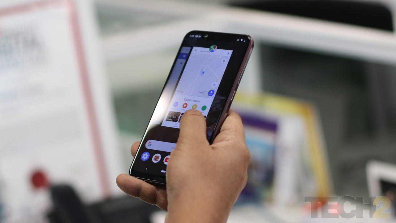
The Nokia 8.1. Image: tech2/Omkar Patne
The interface feels fluid and very Pixel-like with the same swipe to home gestures available out here as well. It’s just that I noticed micro-stutters from time to time when swiping on the home screen. Guess this is something that could be ironed out with future software updates.
Indeed, Android 9 Pie almost makes the 8.1 into the cheaper Pixel 3 Mini we have been waiting for.
For those who love stock Android, the smartphone market offers few options like Xiaomi’s Mi A2, which is priced a lot lower (Rs 15,999) albeit with a less premium-looking design.
As mentioned in the Display section, the addition of the PureDisplay colour profile selection is a welcomed option indeed.
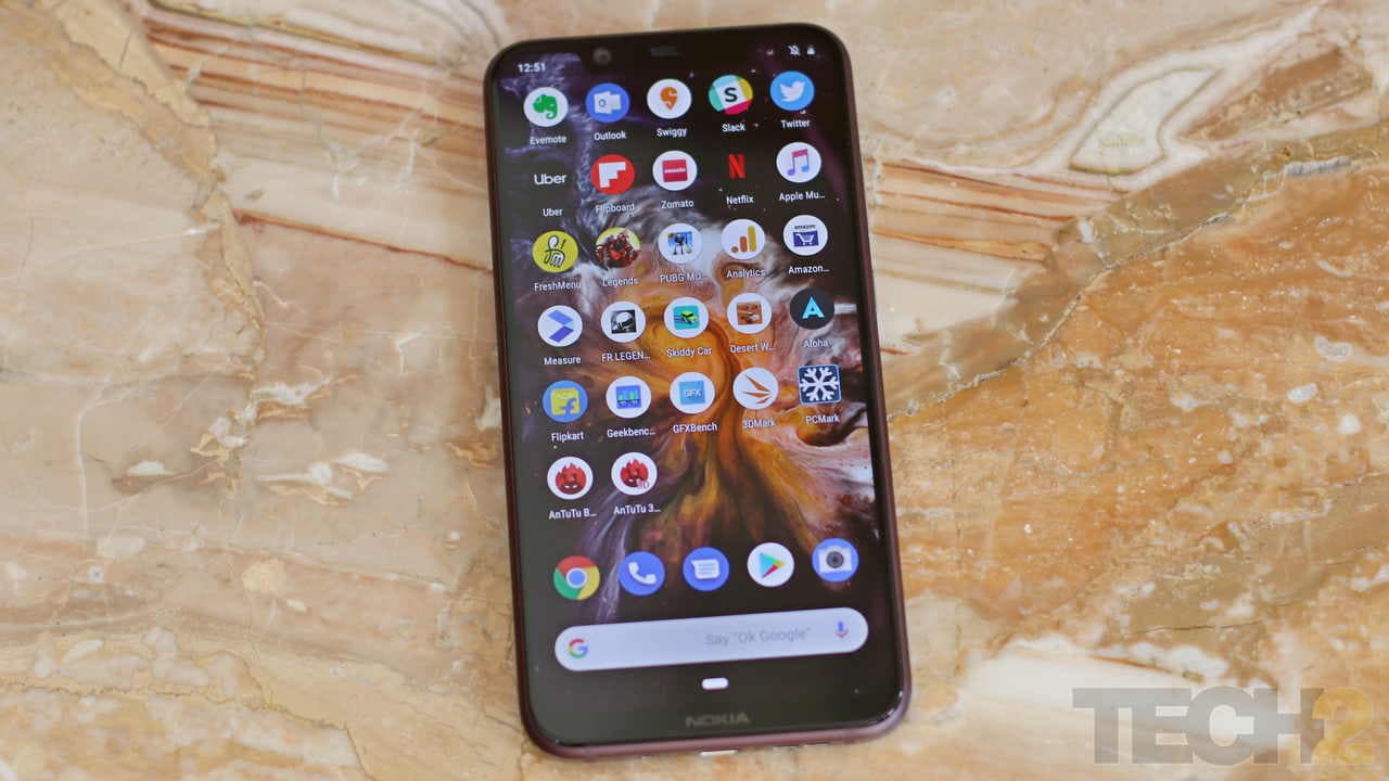
The Nokia 8.1. Image: tech2/Omkar Patne
There are some minor customisations to the stock Android interface apart from the colour profile selector mentioned above. You can double tap to wake the device, swipe down on the fingerprint reader to pull down the notifications tray and even press down on the power button twice to launch the camera.
The camera app also includes a new Pro mode that can be accessed by swiping the shutter button upwards (when held in vertically) offering manual controls (ISO, Shutter Speed, Manual focus, White Balance) for those who want more control while shooting stills.
Nokia 8.1 Performance: 8/10
The performance was not really a problem with the Qualcomm Snapdragon 710 inside, it’s just that the performance jump over the 660 SoC is not too drastic. So don’t expect the 710 to compete with a Snapdragon 835 or even come close to the 845 inside the Poco F1 when it comes to performance. Just take a look at the performance chart below and you will figure out where it stands.
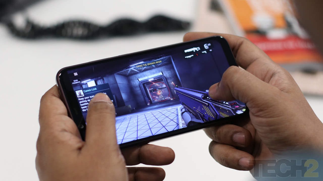
Indeed, it is in this area that a smartphone like the Poco F1 does pack in the power to run games at the highest settings, without stuttering. The Adreno 616 GPU will run games smoothly at default settings but will warm up when playing them at the highest settings. The handset did heat up while playing PUBG Mobile and also warmed up quite a bit while playing Shadowgun Legends at 60 fps (with Ultra high graphics detail) but it did not get hot enough for me to stop gaming. This a bit above average when it comes to smartphones in its class.
The Nokia 8.1. Image: tech2/Omkar Patne
While PUBG and Shadowgun ran smoothly without any hiccups, Asphalt 9:Legends did stutter at the highest possible settings which could be an optimisation problem since this is a brand new SoC and is only available in a few smartphones globally so far.
In short, this is quite a capable gaming smartphone, but the Poco F1 is a better choice if gaming is all you want to do on a smartphone.
The Nokia 8.1. Image: tech2/Omkar Patne
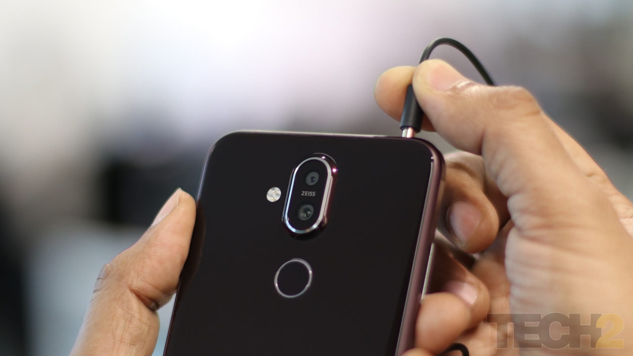
While the Nokia 8.1 comes with a lovely PureDisplay unit, I just wished that Nokia included a second speaker at the receiver. The single speaker was not all that loud and I needed to plug in my earphones every time I wanted to catch up with my daily streaming shows. While I’m glad that I can still plug in my favourite pair of earphones (comes with a 3.5 mm headphone jack), a dual speaker system would have justified that gorgeous display turning this phone into a more media-friendly package.
The Nokia 8.1. Image: tech2/Omkar Patne
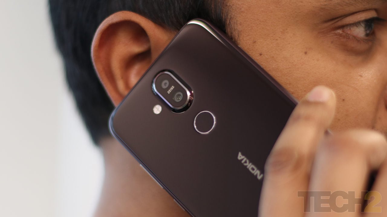
Calls were loud and clear and I saw no dropped calls even in Mumbai’s overcrowded networks. Audio quality using the in-box earphones were decent and lacked bass, plugging in a better pair of earphones delivered rich audio with balanced highs and lows.
Nokia 8.1 Camera: 8/10
While Xiaomi’s Poco F1 packs in some capable hardware, our review of the camera revealed that its implementation was lacking. The Poco may pack in 12 MP f/1.9 main sensor and a 5 MP f/1.9 secondary sensor but the results are a bit of hit and miss, and a complete miss in low light as you will see in the camera comparison samples below.
The Nokia 8.1. Image: tech2/Omkar Patne
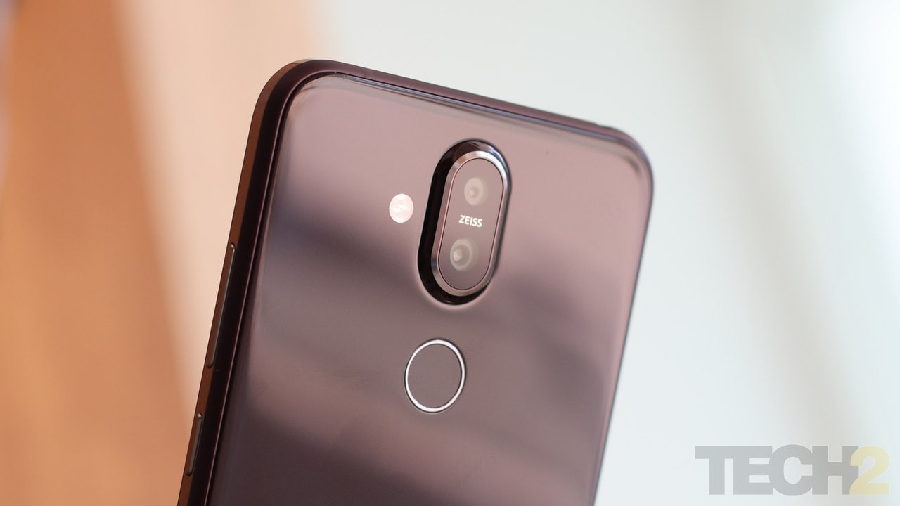
The Nokia 8.1 with its 12 MP AF + 13 MP FF cameras produces some vibrant photographs and they are pretty much at par with the 7 Plus.
Shooting landscapes and people in the standard auto mode delivered photos that were sharp and had just the right amount of noise in daylight. Indoors, the resolved details were a bit low, but the photos remained sharp and vibrant.
The Live Bokeh mode was a bit of hit and miss. Despite the AI claims, edge detection was average. While our office is not exactly set up for photography, there is a window in front of our desks that lets in plenty of light.

The Nokia 8.1 (Left) captures dull portrait images at times as compared to the yellow toned on the Poco F1 (Right). Image: tech2/Sheldon Pinto
For some strange reason, the Bokeh mode produced dull images indoors at times. Most of the times the results were good enough, save for the edge detection which was a bit lacking through and through.
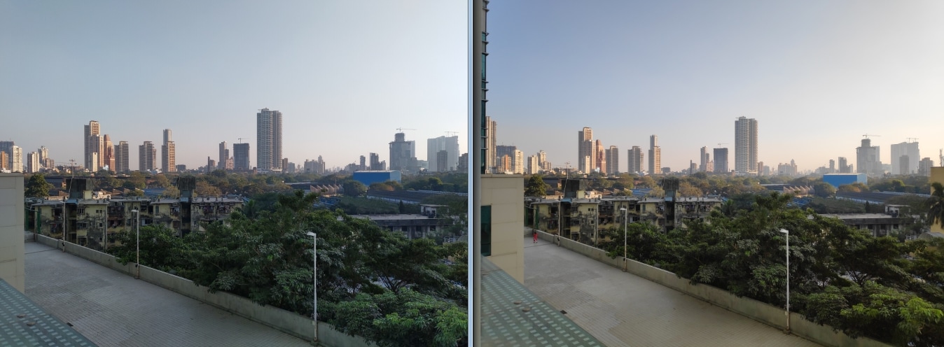
Landscape performance is pretty much the same on the Nokia 8.1 (Left) and the Poco F1 (Right). Image: tech2/Sheldon Pinto
Outdoor shots were also oversharpened. So yes, Nokia does need to polish this mode with upcoming software updates. Clicking selfies and portraits in the regular shooting mode, delivered punchy images with the right level of sharpness and details.
What I liked about the Live Bokeh mode was that it finally saves the depth data, letting you tweak photos in the default Google Photos app after you have shot them.

The Nokia 8.1 (Left) produced some natural-looking images compared to the Poco F1 (Right). Image: tech2/Sheldon Pinto
While the Poco F1 shot clearer photographs in the portrait mode, it completely cleaned up the faces of my subjects and delivered a yellowish tone.
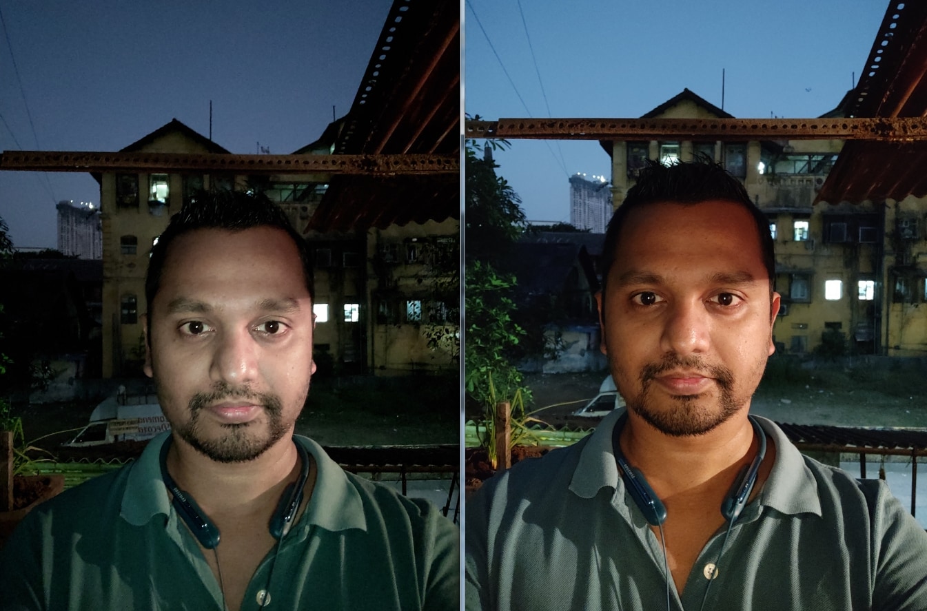
Low light selfies are the only area where the Poco F1 (Right) did a lot better than the Nokia 8.1 (Left). Image: tech2/Sheldon Pinto
Nokia has added OIS to the rear 12 MP camera so this delivers crisper images in low light scenarios. While the photographs are still a bit low on resolved details, they are leagues better than the images produced using the Poco F1’s camera.

While this street shot at night looks similar from afar, take a look at the crop below. Image: tech2/Sheldon Pinto
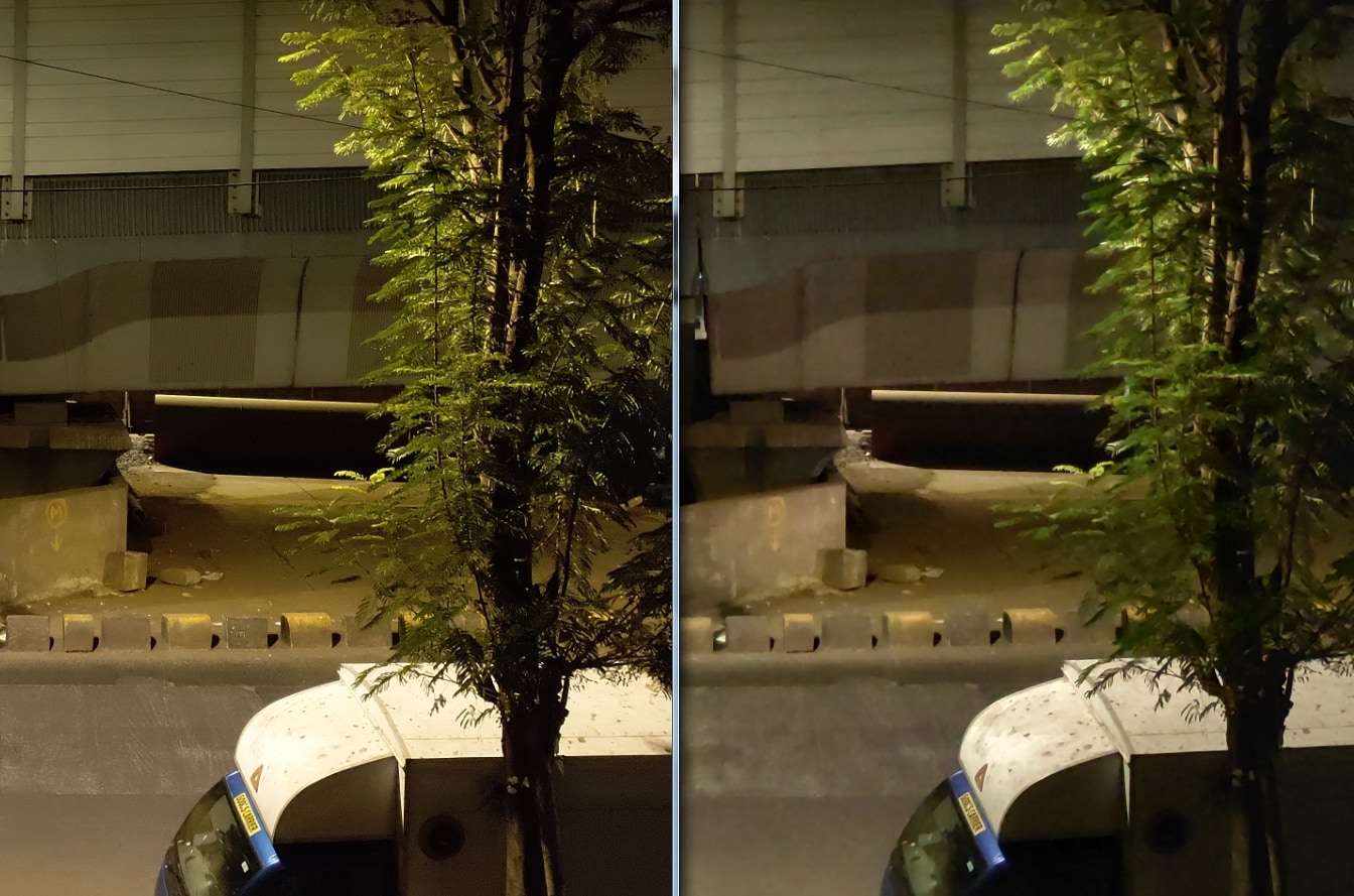
The Nokia 8.1 (Left) showcases far more detail and the images also look a lot sharper compared to the blurry output of the Poco F1 (Right). Image: tech2/Sheldon Pinto
Video is another area where Nokia’s optics and software do a much better job than the Poco F1.
The 8.1 uses EIS to shoot video and the stabilisation you get in all types of lighting conditions is commendable and a lot better than the jittery and jerky video quality of the Poco F1. There’s plenty of detail in the video and the audio sounds really crisp and clear thanks to Nokia’s OZO surround sound capture. Shooting selfie videos was also a good experience thanks to EIS video stabilisation and OZO audio capture.
Nokia 8.1 Battery: 8.5/10
Packing in a sizeable 3,500 mAh battery, the Nokia 8.1 delivered more than a day’s battery life on a single charge. While the first two days saw the battery life drain pretty quickly, Android’s Adaptive Battery feature finally learnt my usage and started delivering decent and above average battery life from the third day. So if you do buy an 8.1, I would recommend using it for a week in case the battery does not perform as expected; by when the Adaptive Battery and Adaptive Brightness AI optimisations will have started doing their magic.
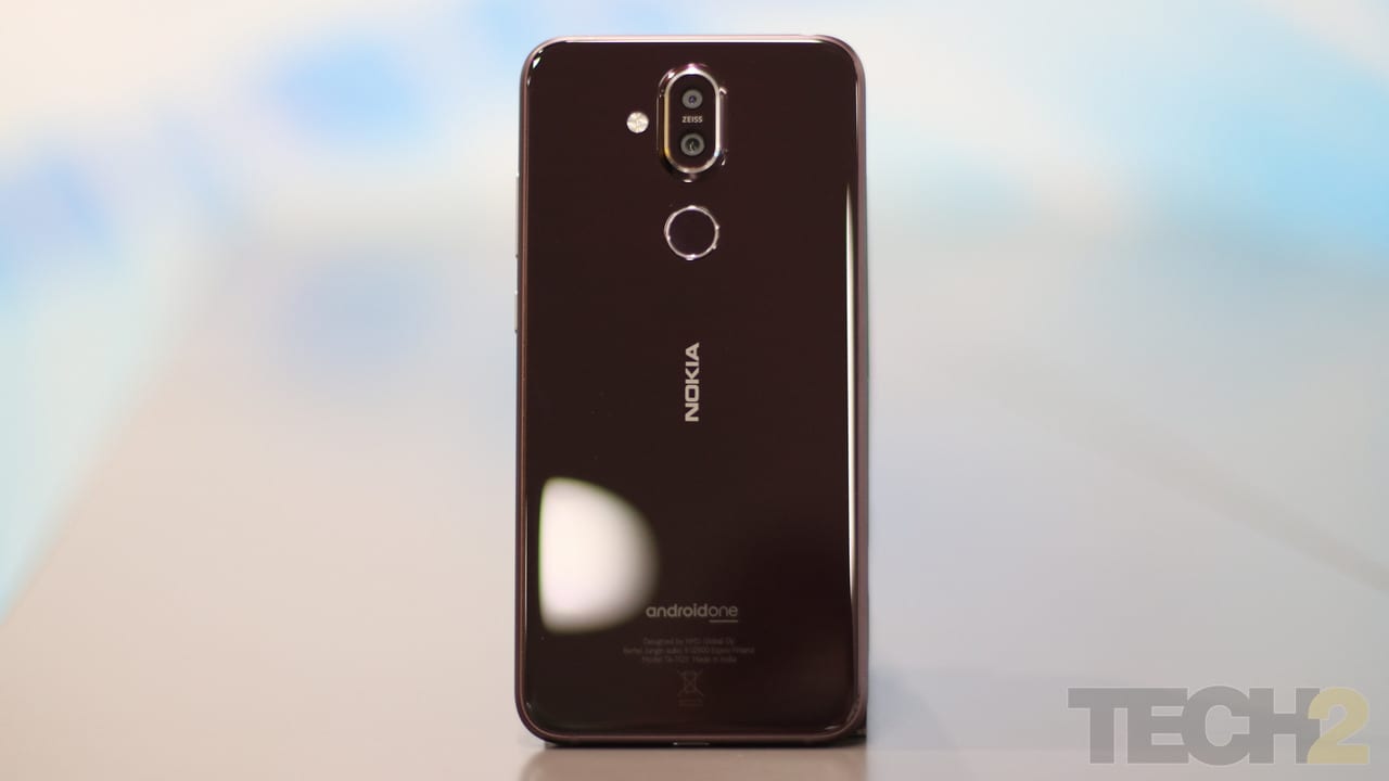
The Nokia 8.1. Image: tech2/Omkar Patne
With Slack, WhatsApp, Telegram and two emails accounts on sync and buzzing through the day, along with some photography, a few calls, and about 15-20 minutes of gaming, you can easily squeeze a day and a half of battery life thanks to the power-efficient 10 nm 710 SoC inside. I don’t remember a single day where I was looking for a charging point, so it's easy to say that the battery life is pretty good, even if it does not stand up to Nokia’s two-day battery life claims. If you are into gaming expect the battery to drain out by the end of the day.
Charging was not as fast as I expected it to be. Nokia offers the 18 W fast charger, but I did find it a bit slow to charge or maybe I’m just a bit spoilt after the stellar charging times on the Huawei Mate 20 Pro. The Nokia 8.1 easily takes more than an hour and a half to charge up to 100 percent from a dead phone which pretty much average for this price segment.
Nokia 8.1 Verdict and Price in India
Stuck between buying a powerful Poco and a classy Nokia 8.1? Let me break it down and make your buying decision easier.
Who should buy a Poco F1?
The F1 is a powerful device and comes with plenty of RAM and storage options that will be more than enough if you love to play games or store a lot of movies and photographs on your smartphone. And literally, that’s about it.
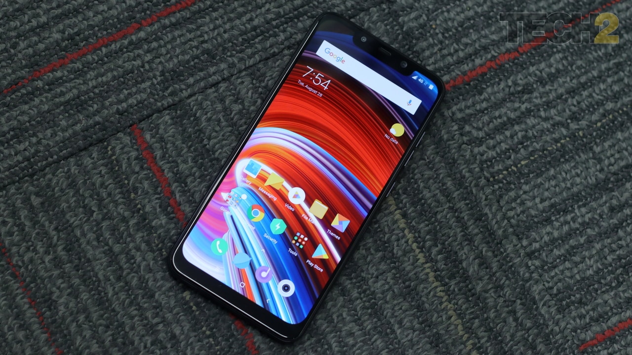
The Poco F1. Image: tech2
The Poco F1 indeed appeals to budget smartphone users (Rs 10,000- Rs 15,000) who would not mind spending a bit more. They will find its camera quality, battery life a raw power too hard to resist given its price tag. It appeals to the spec-hungry youth and indeed makes for a great smartphone if power and gaming is all you crave for.
Who should buy a Nokia 8.1?
The Nokia 8.1 is a premium device and is priced a lot lower (at Rs 26,999) than I expected it to be, considering that its spiritual successor is the gorgeous Nokia 7 Plus. The older phone was launched at Rs 25,999 but ended up selling at higher price tag because of higher demand and low supply.

The Nokia 8.1. Image: tech2/Omkar Patne
The Nokia 8.1 caters to a mid-range buyer and aims to provide a true mid-range smartphone. One that delivers a better camera, better video recording and a brand-new chipset in a package that has been designed to delight. Oh, and did I mention stock Android and faster software updates thanks to the Android One program? The Nokia 8.1 seems to have it all.
Indeed, the two smartphones cannot be compared as both will appeal to different types of customers. But if I had to choose between the two, I would definitely pick the Nokia 8.1.
Tech2 is now on WhatsApp. For all the buzz on the latest tech and science, sign up for our WhatsApp services. Just go to Tech2.com/Whatsapp and hit the Subscribe button.
Source


No comments: