No tech enthusiast of a certain age will ever forget that moment when Steve Jobs pulled the very first MacBook Air from an envelope.
At the time, the Air was a revelation. In an age of inch-thick laptops weighing a proverbial tonne, the svelte Air was something extraordinary. Of course, it had its issues, and it was expensive ($1,799, if memory serves me right), but it heralded an exciting new future.
This was in 2008. In the decade that followed, the Air went from high-end Ultrabook to mainstream workhorse, but it still endured, and there are several good reasons for that. For one, laptop makers of every type started aping the Air’s design elements: narrow wedges with chiclet keys are now so common that they hardly elicit comment. Apple has also pushed the Air towards the mainstream by bringing down its price and moving most of the cutting edge tech to its more expensive MacBook Pro line. The Air survived all this only because it was a brilliant design and exceptionally well built, a quality that is rare to find in even Apple's fast, modern new MacBooks.
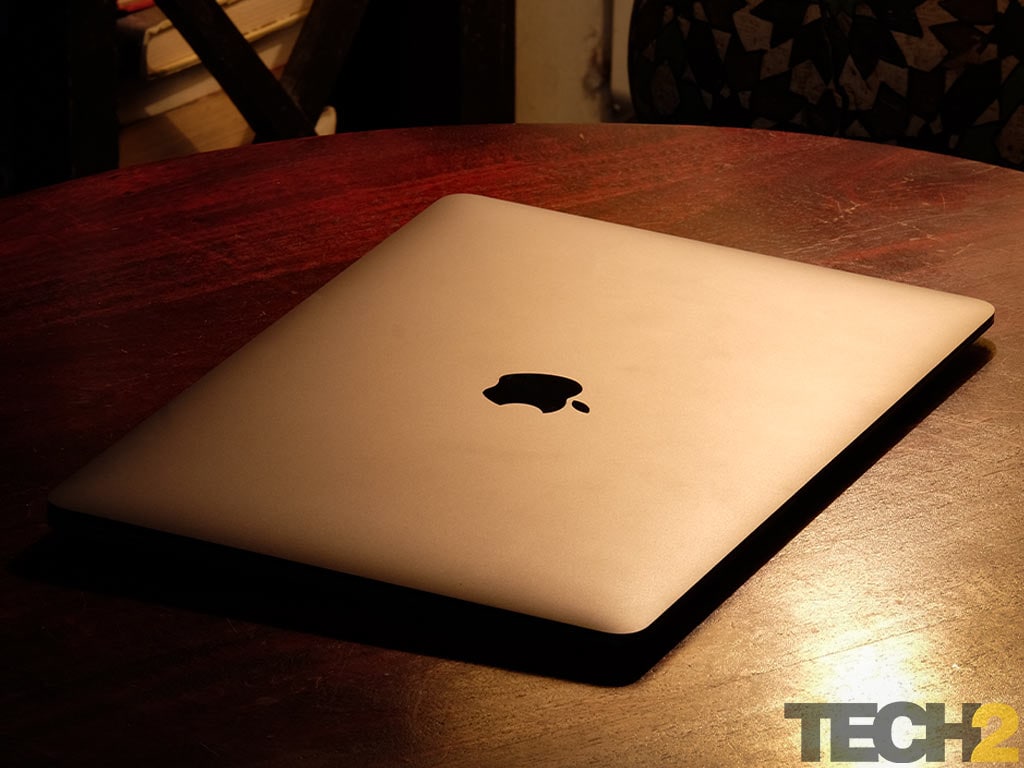
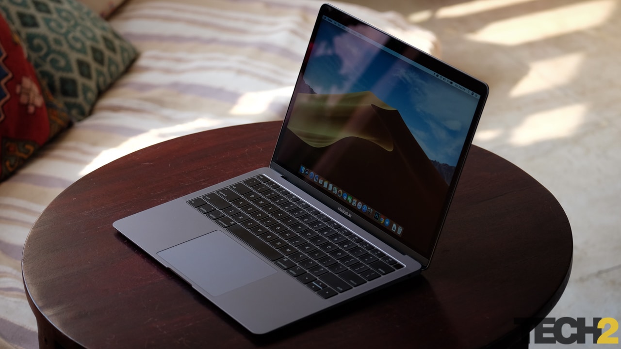
The new MacBook Air is very pretty, but not very exciting. Image: Anirudh Regidi/tech2
For whatever reason, Apple appeared to have given up on the Air for a time. From 2015-17, the Air saw no upgrade. Even the 2015 model only really added in newer CPUs, while the 2017 refresh wasn't really an update since the hardware specs remained unchanged and still carried the worst display in Apple's entire lineup. Nothing about it screams ‘modern’ or ‘high-end’.
Regardless, the Air ended up carving a sort of niche for itself. It wasn’t the groundbreaking device it once was, but it was a cheap and functional entry into Apple’s expensive ecosystem.
Today the Air is neither. It's a confusing entry-point for all but the most die-hard of Air fans. Why?
In terms of power, it’s only fractionally more powerful than the 12-inch MacBook and woefully underpowered compared to the Pro. It's too weak for anything other than very light work.
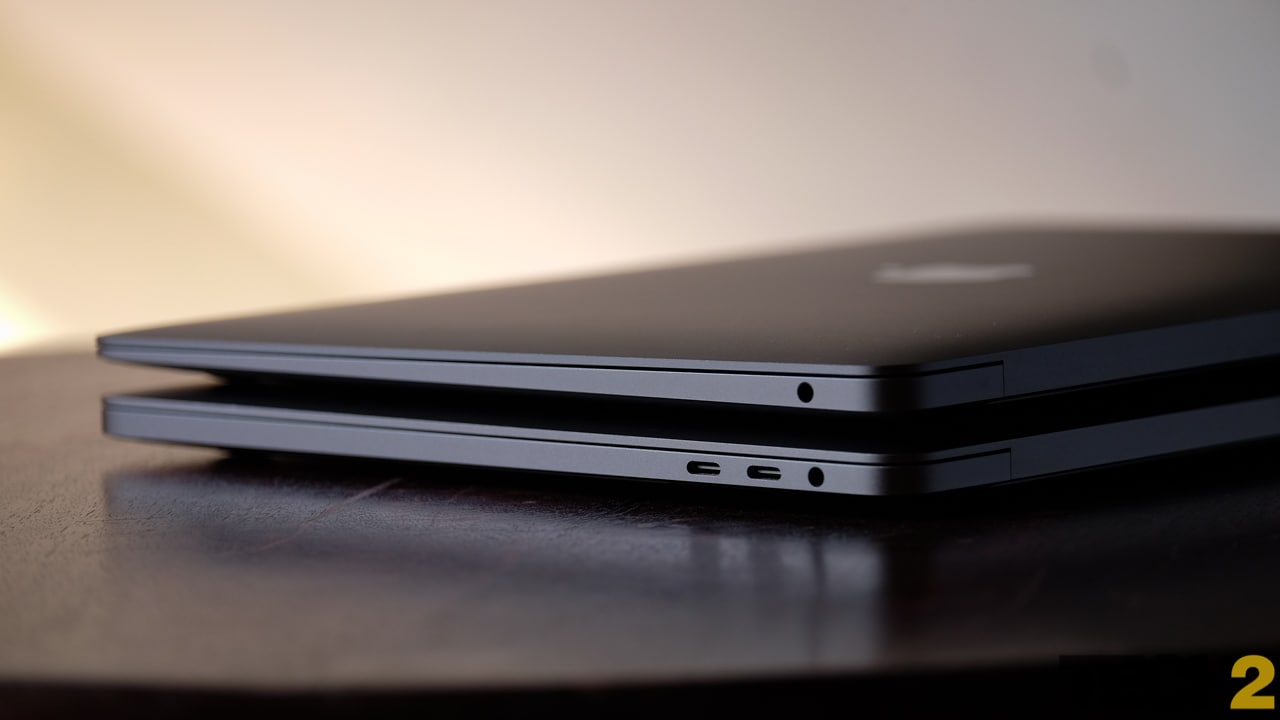
The Reina MacBook Air (Top) isn't that much smaller or lighter than the MacBook Pro (Bottom). Image: Anirudh Regidi/tech2
In terms of design, it is lovely, but it could easily be confused with a 13-inch Pro. Nothing about it stands out.
In terms of weight, it’s almost as heavy as the 13-inch Pro and much heavier than the 12-inch MacBook, in which case, weight is not a factor when buying.
In terms of price, it’s only fractionally cheaper than the far more powerful MacBook Pro, making the Pro the better option by default.
The 2018 Air is a great device, it truly is. But somehow, Apple took a laptop as iconic as the Air and made it an utterly insignificant member of its lineup, and that is what makes it so disappointing.
Apple MacBook Air Build and Design: 8.5/10
If you put the current Air and the previous Air side by side, the old Air looks decidedly ancient. Put the new Air next to a modern MacBook Pro, however, and you’ll be hard-pressed to tell them apart.
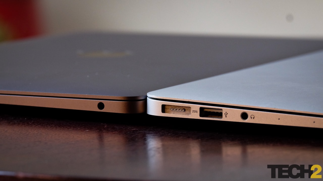
The new Air is (L) a bit thinner than the old one (R) and has far fewer ports. Image: Anirudh Regidi/tech2
Compared to last year’s Air, the new one looks modern. You get the new Butterfly keyboard (3rd gen), speakers on top and of course, that gorgeous new display with bezels measurable in cm and not inches. Also, the display size is still the same at 13.3 inches, but the smaller bezels mean that the 2018 Air is more compact.
The rest of the design is very similar to the new MacBook and MacBook Pro models. The trackpad and top-mounted speakers are a bit smaller than those on the 13-inch Pro, and you have that signature wedge, but everything else is basically the same.
In terms of weight, the Air’s 1.25 kg is a smidge short of the Pro’s 1.37 kg, making the two of them practically the same weight. Toss either laptop in a bag and you won’t be able to tell them apart.
Apple MacBook Air Keyboard and Trackpad: 9.5/10
The Butterfly keys on the Air are just as controversial as they were when they launched, and if you have a strong enough opinion on those keys, these third-generation keys aren’t going to change anything. They have really low travel and are a bit noisy when compared to the keys on the previous Air or regular laptops. Personally, I don’t mind these keys at all, but I could very well be in the minority in this regard.
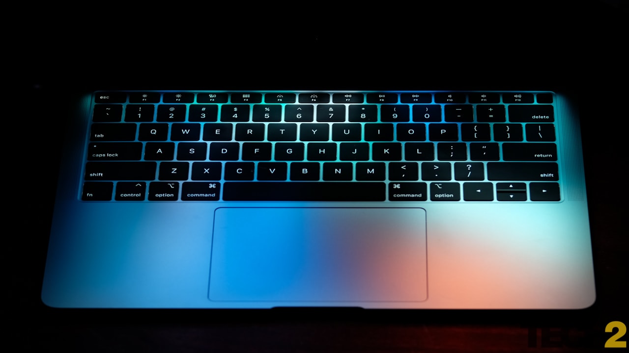
The 2018 Air features a 3rd generation Butterfly keyboard and the very best trackpad we've yet seen on a laptop. Image: Anirudh Regidi/tech2
Thankfully, the Air drops the TouchBar in favour of the more useful function keys. I’ve been using the TouchBar MacBook Pro for a few months now and I certainly missed the TouchBar on some occasions (when changing volume or brightness, scrubbing through video), but I’m far happier without it.
The keyboard is backlit and this is adjusted automatically depending on ambient light. Most Windows laptops just have a 3-stage backlight.
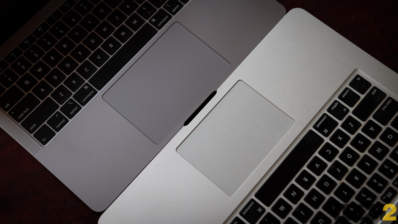
The 2018 MacBook Air's trackpad is just perfect. L: 2018 MacBook Air. R: 2017 MacBook Air. Image: Anirudh Regidi/tech2
A Touch ID button replaces the power button and is just as fast and as reliable as it is on the iPhone 8. I do wish the Air came with Face ID, but hey, I’d rather use my fingerprint than type out a 24-character password.
The trackpad is, quite simply, the best in the business. I can’t for the life of me figure out why Windows device makers can’t come up with a trackpad that’s as large, fluid and responsive as the one on Apple’s MacBooks.
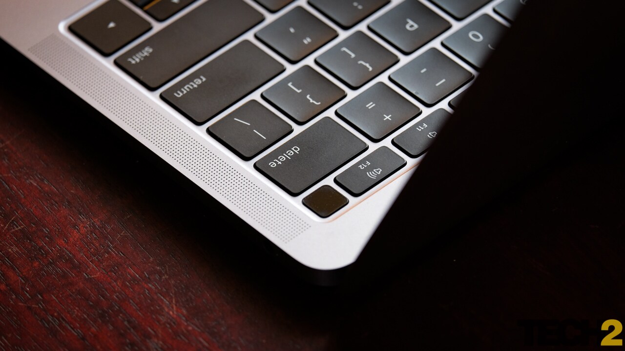
TouchID on the MacBook Air is very convenient. Image: Anirudh Regidi/tech2
The Air’s trackpad is larger than the one on the previous Air but smaller than the one on the new Pros. It is, however, much larger than most trackpads I’ve seen even on 15-inch Windows laptops. In fact, I think Apple nailed the size with this one. The 13-inch Pro’s trackpad is just a tad too big and my palms tend to rest on it when typing. The Air’s trackpad, on the other hand, is nestled perfectly between my palms.
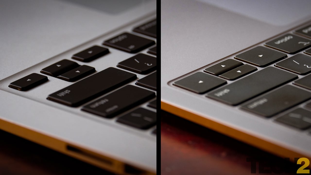
The new keyboard (R) has much lower travel than the earlier one (L). Image: Anirudh Regidi/tech2
This is a ‘Force Touch’ trackpad, which means that, like 3D Touch on an iPhone, it responds to pressure and gives haptic feedback. To click, you simply apply more pressure (as much as you would for a regular click on a trackpad) till you “feel” a click. The trackpad itself doesn’t move. I generally prefer tap-to-click anyway so this is not a feature I used much.
One really good use-case for this trackpad is video playback, where the media controls respond to the pressure you apply on the trackpad. Press the rewind button with more force and the video will rewind at a faster rate.
Apple MacBook Air Features: 6.5/10
The specs are quite dull and unexciting. The CPU is unusual in that we haven’t seen it on any other device, but everything else is bog-standard MacBook fare. You get 8 GB of LPDDR3 memory (upgradeable to 16 GB), 128/256 GB base storage options that can go up to 1.5 TB, a Force Touch trackpad, Touch ID, 2x Thunderbolt 3 ports and a 13.3-inch Retina display (2560x1600 pixels).
The CPU is an Intel Core i5-8210Y, which means it’s a 7 W CPU with a base clock of 1.6 GHz. Apple’s choice of a 7 W chip means that it’s an extremely low power CPU. It won’t get very hot, but it also won’t be very powerful. In fact, this CPU is only slightly more powerful than the barely adequate 5 W CPU on the 12-inch MacBook.
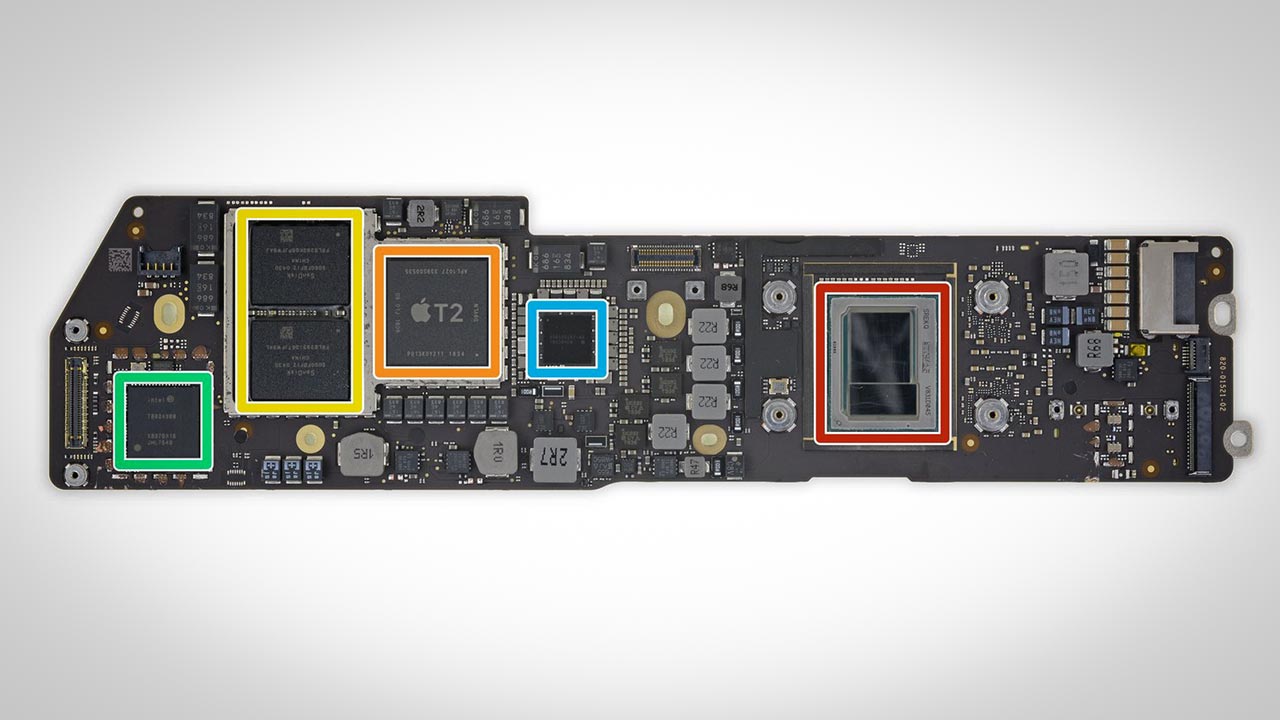
The Air's CPU (red) is so small that it's dwarfed by Apple's T2 security chip (orange). Image: iFixit
The lack of useful ports is also frustrating. The older Air came with 2x USB 3.0, 1x MagSafe, 1x HDMI, 1x Thunderbolt 2 port and an SD card reader. The new Air comes with 2x USB-C ports rated at Thunderbolt 3. Despite Apple’s pretensions to the contrary, and while these ports are the most versatile ports you can get, two ports does not equal five.
To give you an example, say I want to hook up an external display to the Air, I’ll need to use 1x USB-C port for the display and one for power. And that’s it! No more ports. I can’t plug in a wired mouse or keyboard, a pen drive, an SD card, nothing. I either unplug something or I buy an expensive, multi-port dongle. Oh, and you still need a dongle or a new cable to connect your iPhone to your MacBook.
<cue age-old-but-still-relevant rant about #DongleLife>
In fact, the 13-inch TouchBar MacBook Pro is convenient simply because it has twice as many ports. It doesn’t matter that they’re faster. More is just… more.
Apple MacBook Air Display: 8/10
The display is simultaneously the Air’s most exciting and most disappointing feature. Coming from the previous Air, the display is simply stunning. It’s a 13.3-inch Retina display (at last) that can display a much wider range of colours. That being said, the display colour gamut only matches industry-standard specs and the resolution isn't that special anymore.
When it comes to displays, three things matter: Pixel density, brightness and colour gamut. Factors like refresh rate are important, but only to gamers. In the case of a MacBook, that last doesn’t apply.
We finally have a Retina display on the MacBook Air, but it's almost too little too late. Image: Anirudh Regidi/tech2
While it’s good, the Air’s display falls short on two of the three counts.
Pixel density: The Air’s Retina display has a resolution of 2560x1600 pixels or a pixel density of 227 PPI. An average 24-inch PC monitor with a Full HD display has a density of about 94 PPI. The MacBook Air’s 227 PPI is twice that and at par with that of the more expensive MacBook Pros. Strangely enough, while you cannot see pixels on this display, images and text look a tad sharper on the Pro than on the Air.
Brightness: On testing, we found the Air’s brightness to be about 217 nits. This is strictly average and about 60 percent of the max brightness of the MacBook Pro’s display. The Pro’s display measured 373 nits and the Surface Book’s display came in at 300 nits. The Dell XPS 13 also managed 408 nits.
The Air's display is not very bright. Image: Anirudh Regidi/tech2
Given the quality of the display, I don't think brightness will be an issue for a first-time buyer or for someone upgrading from an older Air. That being said, anyone who's used a MacBook Pro in the last two years is likely to notice how dull the display is.
When it comes to Windows laptops, only budget and lower mid-range devices come with 200-nit displays.
Colour gamut: Colour gamut defines the range of colours a display can render. The industry standard right now is something called sRGB and an average monitor should render 90-100 percent of that gamut. If you’ve been paying close attention to the smartphone space, you may have heard the phrase DCI-P3 being thrown around a lot. DCI-P3 is a wider colour gamut that roughly translates to 135 percent sRGB, i.e. more colours. Phones with OLED displays, such as the Galaxy S9 or iPhone XS, support about 150 percent sRGB.
The most noticeable advantage of a wider colour gamut is that images appear more natural with less colour banding.
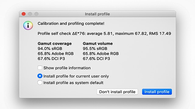
The Air's displays far fewer colours than the slightly more expensive Pro.
On the Air, Apple is offering a 100 percent sRGB-compliant display. This is actually very good because every good Windows laptop that we’ve tested so far has only managed around 90 percent sRGB. Unfortunately, Apple’s MacBook Pro line, which is not that much more expensive, offers a DCI-P3 display.
In other words, the Air’s display is dimmer and duller than that of a laptop that costs just $100 more. To make things worse, the contrast ratio of the Air's display is quite poor (620:1) when compared to the Pro (1100:1). When viewing dark scenes on the Air's display, especially in dark rooms, you'll notice some backlight bleeding around the edges. This does not happen on the Pro.
The Air also lacks support for True Tone, which is a feature that lets the MacBook Pro match its colour tone to the background lighting (paper looks yellow under yellow light, not white). This isn’t a deal-breaker, but it’s just frustrating that the display is so heavily compromised.

A white paper will seem white only when under white light. That's the effect TrueTone aims to emulate.
Yet another frustration for the discerning user is the fact that the Air's display tends to be a bit warmer by default (whites appear slightly yellow).
Luckily for Apple, the average person isn’t going to notice the difference in colour gamut. In blind tests, people claimed that images on the Air looked more “punchy” and that images on the Pro looked more natural. People did note the relatively poor contrast ratio of the Air and commented that the display was too dull.
Individually, these are minor issues to complain about. Taken as a whole, the display is quite a big disappointment. In fact, given the pricing, it's almost an insult.
Apple MacBook Air Performance: 6/10
This is another aspect of the Air that’s infuriating. I suspect that the only reason Apple opted for a 7 W Intel chip in the Air is that they didn’t want to cannibalise the market for the slightly more expensive (by 7 percent) MacBook Pro. I’ve no idea why Apple didn’t just kill off the 13-inch MacBook Pro (non Touch Bar), given it a wedge and rebranded it as the Air. But hey, that’s Apple for you.
Anyway, performance, it’s either great or it sucks and that depends entirely on what you intend to do with this device.
If you're just going to do light work within Apple’s app ecosystem (Pages, Safari, iTunes, QuickTime), you won’t be left wanting. The Air can comfortably handle light workloads such as typing and browsing and will only sip at the battery. Demand even a little bit more from the device, however, and you’ll be in for a nasty surprise.
My job requires me to travel on occasion, and that means I need a laptop with great battery life. I also need to use the internet (quite heavily) for research and for filing stories. The bulk of my time is spent typing and reading, but I also need to use Photoshop and sometimes iMovie for mild photo and video editing. Battery life is yet another exasperating aspect which I’ll address later, but for all the rest, a MacBook Air would seem ideal. It’s light, well-designed and at Rs 1,35,990, anyone would expect it to be powerful enough for light work. But it’s not.
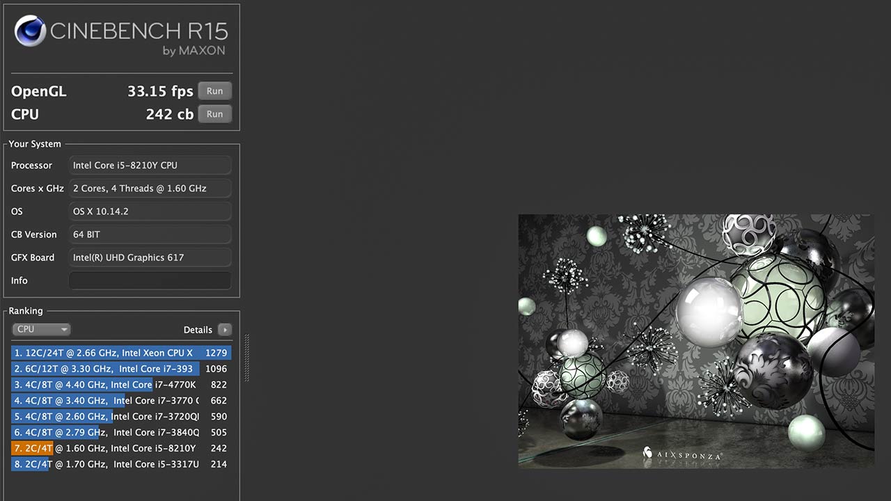
The Air is just powerful enough to be useable.
While typing in Pages and transferring them to Safari was easy, working with Chrome or Firefox with 6-10 tabs open was painful. The laptop immediately starts stuttering and multi-tasking animations become choppy. If I open a dozen or more tabs in Safari, the same thing happens, but at least it’s not as severe.
Are a dozen tabs too much? I mean, I need quick access to the site CMS, email client, news sources (Google News, Google Trends, etc.), social media (Facebook, Twitter, Reddit) and Google Sheets. When researching something, I could easily have a dozen or more reference links open at any given time. Is that really too much to ask from a premium computer in 2018? My iPhone can handle such a load, why can't my laptop?
The few times I had to use Photoshop was also a chore. The app itself takes many seconds to load up and woe be you if you end up having to edit high-resolution images on this machine. Again, my iPhone, which costs half as much, can edit and resize images at twice the pace. Hell, I’d rather have an iPad Pro. There's much to be said for Intel's failings on this front as well, but Apple also had a choice in this matter.
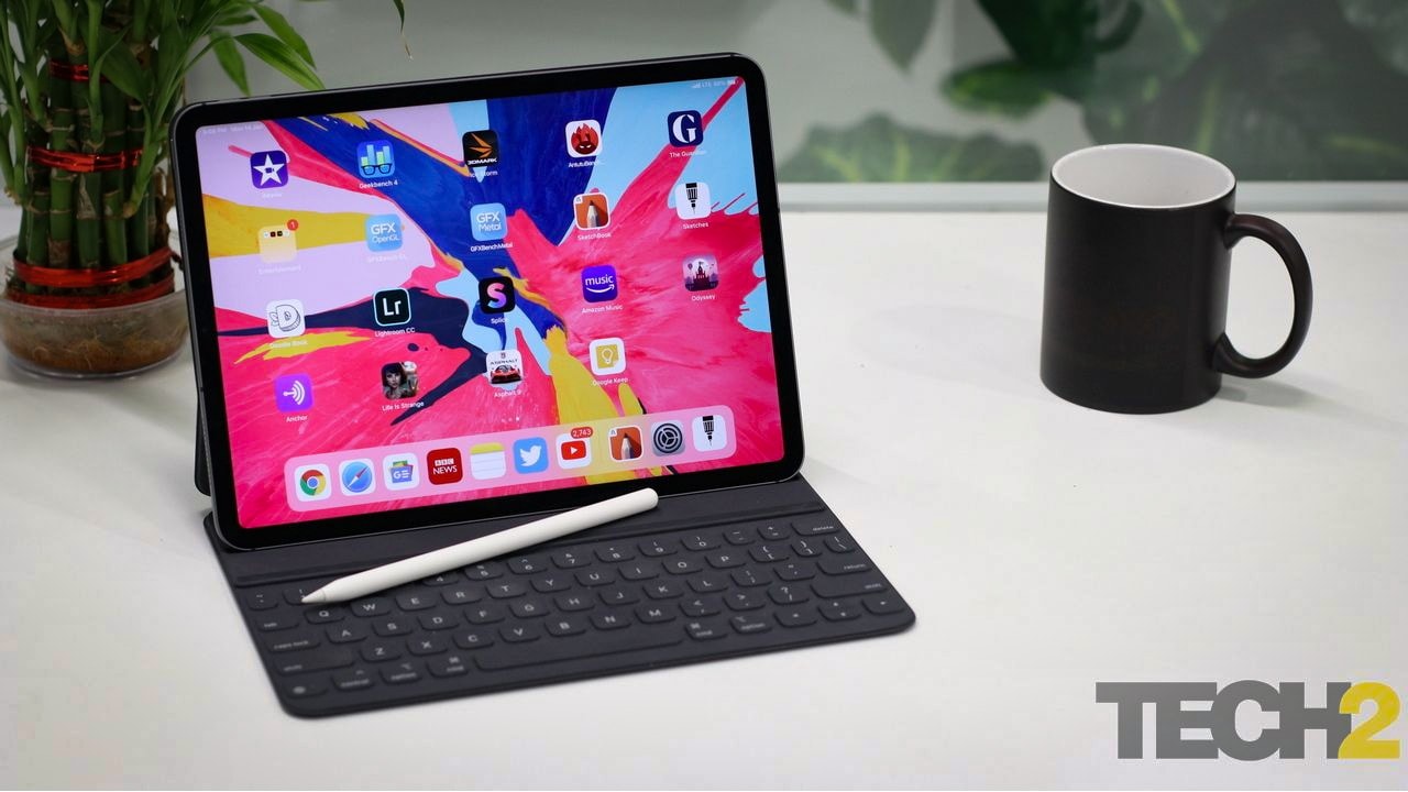
Why wouldn't you just buy an iPad Pro instead? It might actually be more powerful in some scenarios!
Yet again, spend just a little bit more and you’ll get a MacBook Pro that can do all of the above without breaking a sweat.
The only positive aspect of this underpowered CPU is that since the processor can’t do much, the laptop simply doesn’t get hot. In fact, the only time I heard the fan kick in was when I ran a video conversion test, which, incidentally, took five times longer on the Air than it did on the 2018 MacBook Pro (TouchBar).
Apple MacBook Air Battery Life: 6.5/10
As far as I'm concerned, this is the biggest deal-breaker on the Air. If you only do light work (typing in Pages and browsing in Safari), the laptop’s 50.3 Wh battery can easily let it run for nine hrs. Do anything moderately stressful, however, and battery life will simply tank.
As an example, typing for two hrs straight (and browsing for a bit) followed by about an hour of editing in Photoshop brought down the battery life to just under 35 percent. This was at about 60 percent brightness.
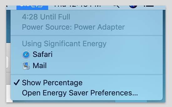
It's 2019, why is it acceptable for any device to take five hrs to charge?
The real horror story with this Mac is charging time. This MacBook Air comes bundled with a pitiful 30 W charger — phones come with 30 W chargers these days. If you use this charger, it will take you around five hrs to fully charge your Air.
Five. Whole. Hours. Wha…?
I was made painfully aware of this point on a recent 40-hr journey to the US. While the laptop helped me survive the first leg of the journey (14 hrs), I couldn’t charge the laptop enough during the layover, managing to only get it to a little under 30 percent in the hour or so I had to spare. I had to survive the next 9-hr leg on only my phone (The horror!). My MacBook Pro with its 58 Wh battery lasts longer under moderate to heavy loads, performs better and charges twice as fast with the included 61 W charger. The Air can also be charged twice as quickly with the 61 W charger, and said 61 W charger isn't so horrifically large that you'd rather carry the tiny 30 W unit.
I would normally consider this penny-pinching on Apple’s part, but now I think it’s just Apple pursuing some misguided-yet-high-minded ideal about lightweight chargers with lightweight devices or some such rubbish. Tim Cook said as much when asked about the 5-hr charging time on the iPhone XS Max.
Apple MacBook Air Verdict and Price in India
The 2018 MacBook Air is a lovely laptop and if I didn't know any better, I'd be drooling over one at the Apple store right now. Since I do know better, this is by far the biggest disappointment of 2018. This is a laptop that exists only to propagate its line. It doesn’t fill any gaps in Apple’s line-up, it’s not a trend-setter and it’s not even particularly useful. The Air isn't frustrating because it's a bad device, far from it, it's frustrating because I know that Apple can, and has done, better. I know I'm being very critical of this machine, but a Rs 1,35,990 machine deserves that scrutiny and criticism.
What’s irritating is that there’s no alternative I can comfortably recommend. See, the 12-inch MacBook and the 13-inch MacBook Pro (sans TouchBar) are both great laptops and better alternatives, but they’re both using the 2nd generation Butterfly keyboard. That keyboard is defective, an issue that Apple has acknowledged and attempted to fix in the 3rd generation keyboards that you’ll find only in the 2018 TouchBar MacBook Pro and the 2018 Retina MacBook Air.
[youtube https://www.youtube.com/watch?v=2tbVDV1xdQI]
Basically, if you’re in the market for a MacBook, your only real choices are the Retina MacBook Air and the 2018 MacBook Pro with TouchBar. That’s a very poor set of options for an Apple user, it’s like being forced to choose between a 1 BHK flat or a 5-bedroom duplex. There’s nothing worthwhile in-between.
The TouchBar MacBook Pro costs Rs 1,70,000 in India ($1,799 in the US) and is powerful enough to put almost any Windows Ultrabook to shame. It is overpriced in India, but Apple’s premium might still be worth paying since you're still getting an unmatched experience.
The 256 GB Air costs Rs 1,35,000 in India ($1,399 in the US) and is incredibly underwhelming and a study in compromise. This one is not worth it, and especially not when the more powerful and capable 2017 MacBook Pro can be had for as little as Rs 1,10,000 if you know where to look. Keyboard issues aside, the 2017 Pro is the better machine by every conceivable metric. And if you really want portability, the 12-inch MacBook is significantly lighter, just as capable as the Air and at Rs 1,09,000, much cheaper.
Better yet, don’t even bother with the Air. Rs 1,35,000 is way too much money to spend on a laptop as underpowered and underwhelming as this one. Either wait for the 2019 MacBook and 13-inch Non-Touch Bar Pros or simply pick up the more capable Microsoft Surface Laptop 2 or Dell XPS 13.
Tech2 is now on WhatsApp. For all the buzz on the latest tech and science, sign up for our WhatsApp services. Just go to Tech2.com/Whatsapp and hit the Subscribe button.
Source

No comments: