Sheldon PintoMar 22, 2019 14:42:00 IST
Vivo recently launched its V15 Pro flagship and it packed in plenty of new hardware including a 48 MP camera and a shiny-new Snapdragon 675 SoC, which made its debut in India with the handset.
The Vivo V15 Pro in our review faired really well with its attractive design and great selfie camera but lost out with the primary camera producing average low light performance and not-so-intuitive software experience.
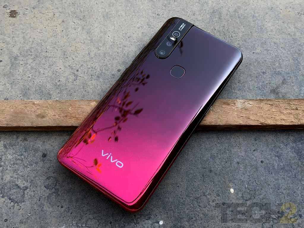
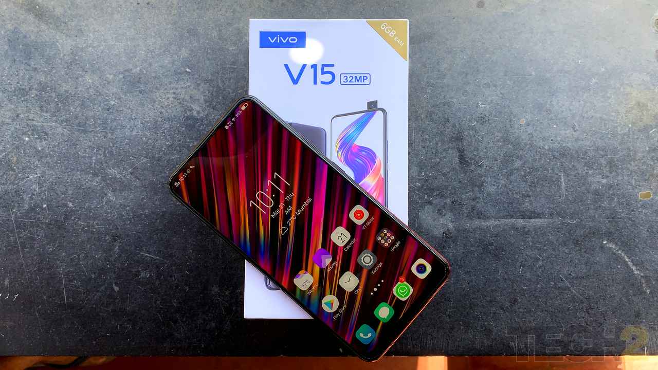
The Vivo V15. Image: tech2/Sheldon Pinto
After using the just-launched Vivo V15 Glamour Red review unit for a day, I can conclude that not much has changed since the V15 Pro. But going purely by the specifications, it does pack in different hardware, so let’s have a look at what the affordable V15 has to offer.
A Vivo V15 Pro lookalike
Coming from the same V15 series, the V15 looks almost identical to the more premium V15 Pro. It’s missing that cool-looking texture from the Pro model, but Vivo has given the V15 its own identity by adding a dash of sparkle at the bottom end of the back.
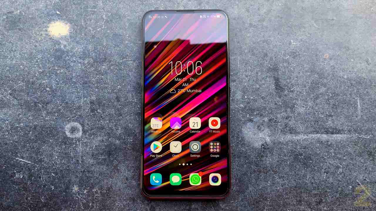
The Vivo V15. Image: tech2/Sheldon Pinto
I received the Glamour Red unit (which reminded me of the Cherry Red on Iron Man’s suit) for review and it definitely is a head-turner with its gradient paint job. This dual tone finish has been a design trend that has been present on every Oppo and Vivo smartphone since the second half of last year. The gradient paint job runs not just over the back panel but also on the frame along the sides.
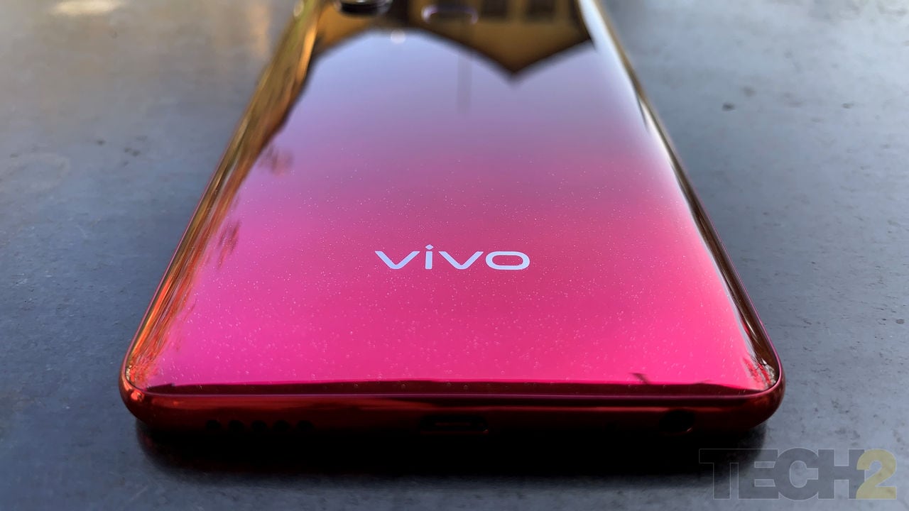
The Vivo V15. Image: tech2/Sheldon Pinto
While the front display is made of Gorilla Glass 5, the rear panel feels a bit like plastic instead of glass and you tell this by simply touching it. The frame is also made of plastic and the design overall feels a bit chubby but is still comfortable to hold. The phone also feels quite large and heavy to hold given that it weighs 189.5 grams.
Look Ma, no notch!
Yes the Vivo V15, just like its elder sibling does not feature a display notch.

The Vivo V15. Image: tech2/Sheldon Pinto
In what appears to be a movement of sorts with the BBK siblings this year (OnePlus 7 will skip on the notch too, most likely), there’s been an increasing inclination by manufacturers to skip on the display notch this year in the mid-range segment. The massive 6.5-inch FHD+ display is not as impressive as the AMOLED unit on the V15 Pro, but it is quite sharp at first glance given its 19.5:9 aspect ratio and 1,080 x 2,340 resolution.
A camera that pops
And where there’s no notch, there’s always a pop-up camera.
Similar to what Oppo has done with its F11 Pro and Vivo with the V15 Pro, the V15 also gets the pop-up camera treatment. It pop's up quickly when needed, captures a 32 MP selfie and will be out of sight before you even notice it. But you also need to be careful of handling the phone well when the camera is popped up.
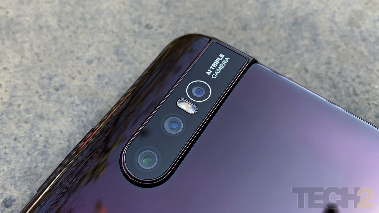
The Vivo V15. Image: tech2/Sheldon Pinto
As for the rear camera, Vivo went in for a 12 MP (f/1.7) + 8 MP (f/2.2) + 5 MP (f/2.4) triple camera setup, instead of the 48 MP sensor on the Pro model.
The 12 MP camera is the primary camera with a regular wide-angle lens (24 million photosensitive units), the 8 MP camera features an ultra wide-angle lens but does not feature an autofocus system and the 5 MP sensor is purely in place for depth sensing.
During my short testing period, I can tell that selfie camera on the front does click impressive looking selfies. But I’m not so impressed with the photo from the rear camera. More about this in my full review.
Interesting choice of hardware
Vivo skipped on the Qualcomm Snapdragon 675 SoC and went in for a MediaTek P70 for the V15. It’s paired with 6 GB of RAM and offers 64 GB of storage space. Remember that Oppo used the P70 SoC in its mid-range F11 Pro, so my hopes are high that Vivo has optimised it well and that it won’t disappoint when it comes to performance.
The Vivo V15. Image: tech2/Sheldon Pinto
What I liked about the Vivo V15 is that it offers three separate slots for the two nano SIM cards and the microSD card. There’s still a microUSB port at the bottom end, next to the single speaker grille. Come on Vivo! It’s time to move to USB C! (Even Samsung has one in its Galaxy M30).
The good bit here is that Vivo bundles an 18 W fast charger in the box and it uses that microUSB port to quickly charge that massive 4,000 mAh battery, which is even bigger than 3,700 mAh unit in the V15 Pro.
Will it blend?
As you can tell, the Vivo V15 delivers a mix and match of hardware and design bits that helped Vivo bring down the price tag of the device from Rs 28,990 to Rs 23,990. It went with a MediaTek chipset, slapped on a plastic body that almost looks identical to the Pro model, and stuck a bigger battery inside with a slightly underpowered camera setup. But will it be enough to make it a worthy offering against the Oppo F11 Pro and the Nokia 8.1? Find out in our review of the Vivo V15 which should be out soon!
Tech2 is now on WhatsApp. For all the buzz on the latest tech and science, sign up for our WhatsApp services. Just go to Tech2.com/Whatsapp and hit the Subscribe button.
Source

Great design
ReplyDeleteWow i really love to get this phone
ReplyDelete